
In the competitive world of mobile apps, great UI/UX design isn't just a nice-to-have—it's essential for success. Users form impressions about your app within seconds, and intuitive, engaging design can be the difference between an app that thrives and one that gets deleted after the first use. This guide explores key UI/UX principles and best practices to help you create mobile experiences that users love.
Understanding the Fundamentals: UI vs. UX
While often mentioned together, UI (User Interface) and UX (User Experience) are distinct aspects of design that work in harmony to create successful mobile applications:
- User Interface (UI) focuses on the visual elements users interact with—buttons, icons, typography, color schemes, spacing, and overall visual style.
- User Experience (UX) encompasses the entire journey and how users feel when using your app—including information architecture, user flows, interactions, accessibility, and overall satisfaction.
Great mobile app design requires excellence in both areas. Let's explore the essential principles and best practices for each.

Essential UI Design Principles for Mobile Apps
1. Embrace Clarity and Simplicity
Mobile screens have limited real estate, making clarity and simplicity non-negotiable principles:
- Focus on essential elements and remove visual clutter
- Use clear visual hierarchy to guide users' attention
- Implement consistent design patterns throughout the app
- Provide clear visual feedback for interactions
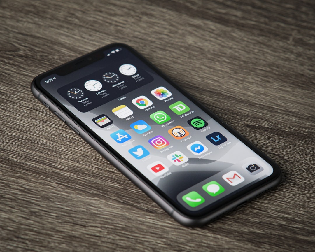
Example: Compare Instagram's clean, focused interface to apps with cluttered screens. Instagram prioritizes content with minimal UI elements, making the experience feel intuitive and unobtrusive.
2. Design for Thumb-Friendly Navigation
Most users hold their phones with one hand and navigate with their thumb. Optimal UI design accounts for this behavior:
- Place key interaction elements within the "thumb zone"—the area easily reachable by the thumb
- Position critical navigation at the bottom of the screen for easier access
- Consider larger tap targets (minimum 44×44 pixels) to improve accuracy
- Implement swipe gestures for common actions

3. Use Color Strategically
Color isn't just about aesthetics—it guides users, creates hierarchy, and communicates meaning:
- Develop a limited, purposeful color palette (2-3 primary colors plus neutrals)
- Use contrast to highlight important elements and improve readability
- Apply color consistently to establish meaning (e.g., green for success, red for errors)
- Consider color accessibility for users with visual impairments
- Test your color scheme in different lighting conditions
Example: Banking apps often use blue (suggesting trust and security) as their primary color, with high-contrast colors to highlight important actions like transfers or payments.
4. Typography That Works on Small Screens
Effective typography enhances readability and establishes hierarchy on mobile devices:
- Select fonts designed for screen readability (Sans-serif fonts often work well)
- Use no more than 2-3 font families throughout the app
- Maintain sufficient text size (minimum 16px for body text)
- Establish clear typographic hierarchy with size, weight, and spacing
- Ensure adequate contrast between text and background
- Allow for dynamic text sizing to accommodate accessibility needs
5. Visual Feedback and Animation
Thoughtful visual feedback and animations enhance usability and delight:
- Provide immediate feedback for all user interactions
- Use micro-interactions to acknowledge user actions
- Implement purposeful animations that guide users and explain transitions
- Keep animations subtle and brief (under 400ms) to avoid frustration
- Ensure animations have purpose beyond decoration
Example: Apple's iOS uses subtle animations when opening and closing apps to help users understand where they're navigating from and to.

UX Design Best Practices for Mobile Apps
1. Streamlined User Flows
Efficient user flows minimize friction and help users accomplish their goals quickly:
- Identify and optimize critical paths in your app
- Minimize the number of steps required to complete tasks
- Reduce cognitive load by breaking complex tasks into manageable steps
- Prioritize common tasks and make them immediately accessible
- Eliminate unnecessary decisions and inputs
Example: Food delivery apps like DoorDash optimize the ordering flow to minimize friction, letting users reorder previous meals with just 1-2 taps.
2. Intuitive Navigation Patterns
Navigation is the backbone of UX—it should be predictable and easy to understand:
- Use familiar navigation patterns (tab bars, hamburger menus, etc.) that users already understand
- Clearly indicate the current location within the app
- Limit navigation depth (3 levels maximum when possible)
- Provide clear ways to go back or return to home
- Consider task-based navigation for complex apps
3. Thoughtful Onboarding
Effective onboarding familiarizes users with your app and demonstrates its value quickly:
- Keep initial onboarding brief and focused on core value
- Show rather than tell through interactive demonstrations
- Implement progressive onboarding that teaches features as users encounter them
- Allow users to skip onboarding if desired
- Delay permission requests until they're needed and explain why they're necessary

4. Accommodating Edge Cases
Anticipating and designing for edge cases creates a more robust user experience:
- Design for empty states (first use, no results, etc.)
- Create helpful error messages that explain what went wrong and how to fix it
- Implement skeleton screens during loading rather than generic spinners
- Account for offline usage scenarios
- Design for both portrait and landscape orientations when appropriate
Example: Pinterest's empty states encourage exploration by suggesting content rather than showing a blank screen.
5. Accessibility as a Priority
Accessible design isn't just ethical—it expands your user base and often improves usability for everyone:
- Support screen readers with proper labeling and semantic structure
- Ensure sufficient color contrast (WCAG AA standard minimum)
- Provide text alternatives for non-text content
- Design for keyboard/external device navigation
- Support text resizing without breaking layouts
- Consider voice input and alternative interaction methods
Testing and Iteration: The Key to Great UI/UX
Even with all best practices applied, UI/UX design is inherently iterative. Regular testing with real users is essential:
- Usability Testing: Observe users completing tasks to identify friction points
- A/B Testing: Compare different design solutions to determine which performs better
- Analytics: Use data to identify where users struggle or drop off
- Feedback Collection: Provide easy ways for users to share their experiences
- Heatmaps and Session Recordings: Visualize how users interact with your interface
Emerging UI/UX Trends for 2024
While core principles remain constant, UI/UX design continues to evolve. Here are some trends to consider for 2024:
- Dark Mode and Customization: Providing interface options that accommodate user preferences
- Voice User Interfaces (VUI): Complementing traditional touch interfaces with voice commands
- Micro-interactions and Animation: Subtle animations that enhance usability and delight
- Augmented Reality Integration: Blending digital interfaces with the physical world
- Biometric Authentication: Using face, fingerprint, or voice recognition for seamless security
- Personalization: Adapting interfaces based on user behavior and preferences
Conclusion
Great UI/UX design in mobile apps results from a thoughtful balance of aesthetics, usability, and functionality. By applying these principles and best practices, you can create mobile experiences that not only look beautiful but also work intuitively, solving real problems for your users.
At HellcaseA, we provide tools and resources to help developers implement these UI/UX best practices efficiently. Our platform includes design templates, testing tools, and analytics to help you create mobile apps that users love to use.
Remember that exceptional UI/UX design is never "finished"—it evolves through continuous learning, testing, and refinement based on user feedback and changing needs.


Comments (4)
Laura Chen
April 6, 2024 at 11:42 AMThe section on accessibility is so important! I'm glad to see it highlighted as a priority rather than an afterthought. I've found that designing with accessibility in mind from the beginning actually leads to better designs overall, even for users without disabilities.
Alex Thompson
April 5, 2024 at 5:23 PMGreat article! I'd add that animation timing is critical - I've seen too many apps with animations that feel slow and end up frustrating users. The 400ms guideline is spot on.
Leave a Comment